
I’ve written a couple of articles now on how to write HTML forms for the modern web. The previous articles focused on semantics and accessibility, which are the foundation for any good form. If you’re interested in the overview of the entire series, here’s what it looks like:
- Part 1: Semantics
- Part 2: Accessibility
- Part 3: Custom Styles
- Part 4: User Experience
- Part 5: Security
This will be part 3, and it’s probably the article I’m most excited for. We’re going to look at some common form design patterns, some of the gotchas, and how to approach them with CSS. Hopefully we won’t need to get too hacky and you’ll be able to walk away with some new knowledge and code snippets.
Styling Forms is Not Great
As a web developer, you will run into the scenario where you have to write custom styles for some form input. If you’re lucky, it will be a simple text field. Those are pretty straight forward.
If you’re not lucky, however, you will need to style one of the “troublesome” elements in MDN’s “Advanced Form Styling” article. These are elements that have their own browser-provided styles which are tricky to customize.
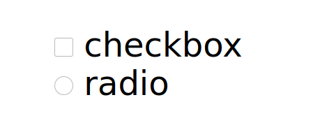
The list of troublesome input includes:
checkboxcolordatalistdate/datetime/datetime-local/time/week/monthfilemeternumberradiorangeprogressselect/option/optgroupsearch
That’s not a short list. Fortunately, we are going to look at solutions to cover the most common needs you will have. The thing to remember before styling is to get the semantics and accessibility correct first!
I like to start with some global styles applied to all my inputs, and a visualy-hidden utility class for accessible, but hidden content:
input,
select,
textarea {
  width: 100%;
  max-width: 100%;
  font: inherit;
  color: inherit;
}

input[type="checkbox"],
input[type="radio"],
input[type="submit"],
input[type="button"] {
  width: auto;
}

fieldset,
legend {
  margin: 0;
  border: 0;
  padding: 0;
}

.visually-hidden {
  position: absolute;
  overflow: hidden;
  clip: rect(0 0 0 0);
  width: 1px;
  height: 1px;
  margin: -1px;
  border: 0;
  padding: 0;
}
The following examples will highlight only the critical points of markup and CSS, but I’ll also link to more practical examples that look nice.
The Easier Ones
Number
The number input will be the simplest one to address. The only thing I’ve ever had to search for is how to hide the little increment/decrement buttons you see when the input is selected.
Hiding them is very simple. It boils down to setting the appearance property Chrome to none, and to textfield in Firefox:
input[type="number"]::-webkit-inner-spin-button,
input[type="number"]::-webkit-outer-spin-button {
  appearance: none;
}
input[type="number"] {
  -moz-appearance: textfield;
}
Select

The select input will be more interesting. This is the first question I remember having around custom styling for inputs: “How do you customize the arrow for a select?“
The answer is actually quite simple, and requires two parts:
- First we hide the native dropdown by setting the
appearanceCSS property tonone. Easy enough. - Then we provide our own custom arrow/chevron. My preferred way is to use an encoded SVG as a CSS background image.
My reasoning for the encoded SVG is:
- Using a CSS background image will be applied to all
<select>elements without needing custom markup like an inline SVG would. - SVG will be crisper and possibly a smaller footprint than a PNG or JPG.
- I encode it because it’s small enough that it won’t bloat the CSS too much, and we avoid the extra HTTP request if we did a URL asset (no caching benefit though).
Finally, we’ll add a bit of padding to make sure the selected option does not overlap the background image. Here’s what the CSS looks like:
select {
  -webkit-appearance: none;
  -moz-appearance: none;
  appearance: none; /* hides the native UI */

  padding-right: 1.5em; /* prevents input text from running into background image */

  background-image: url('data:image/svg+xml;utf8,<svg xmlns="http://www.w3.org/2000/svg" viewBox="0 0 8 8" fill="none" stroke="black"><path d="M7.5 3L4 6 .5 3"/></svg>');
  background-size: 0.7em;
  background-repeat: no-repeat;
  background-position: right 0.5em center;
}
Some more good news is that it’s quite easy to swap out whatever other SVG you want right in there as well, or change the color by adjusting the stroke. The bad news is that SVGs used as CSS background images cannot inherit the color of their context (using currentColor for example). So if you want to do something like that, you will either need to provide multiple class modifiers, or just use an absolute-positioned inline SVG.
See the Pen https://codepen.io/Stegosource/pen/gOPKqox by Austin (@Stegosource) on CodePen.
This solution works fine for the initial display of the select, but it doesn’t let us customize the actual options. Unfortunately, <option> and <optgroup> elements cannot be styled much beyond colors. If you need that, you’ll have to build your own totally custom version. I’ll suggest the article “<select> your poison” by Sarah Higley if you’re interested in going down that rabbit hole.
Search
The first thing I want to say about the search input is that you may not actually need it. text may be perfectly fine for your use-case, and in fact, Adrian Roselli has a good article against using search at all. The following content still applies for text inputs that you want to style for search forms, however.
The search input is another relatively simple element to style, but there are a couple of things you should know. At first glance, it may look just like <input type="text">, but there are a couple of things to note. 1) for Chrome users, a search input will also render a cancel button to clear out the input, and 2) for those of you that REALLY care about every pixel, there is a slight variation to the spacing around a search input.
Beyond that, it’s not much different than your basic text input. So why spend time talking about it? Well, there are a couple of things you may want to consider.
If you want to write CSS that targets all search inputs across your site and style them differently than basic text inputs, you can do so with input[type="search"]. The styles could be very similar to our custom select above, but just swap out the SVG background image like so:
input[type="search"] {
  padding-right: 1.5em;
  background-image: url('data:image/svg+xml;utf8,<svg xmlns="http://www.w3.org/2000/svg" viewBox="0 0 16 16" fill="none" stroke="black" stroke-width="2"><circle cx="7" cy="7" r="6" /><path d="M11 11 L15 15" /></svg>');
  background-size: 0.7em;
  background-repeat: no-repeat;
  background-position: right 0.5em center;
}
Something worth noting is that Chrome adds a small cancel button to search inputs. If you want to remove it, you can use the following CSS snippet:
input[type="search"]::-webkit-search-cancel-button {
  display: none;
}
See the Pen https://codepen.io/Stegosource/pen/zYraepg by Austin (@Stegosource) on CodePen.
And there’s another important consideration for search forms. If you want to have a search form that only contains a text input and search icon, then the search icon could be an absolute-positioned submit button. This was discussed in my semantics and my accessibility posts. It could look like this:
<form>
  <label for="search">
    <span class="visually-hidden">Search</span>
    <input type="search" name="search" id="search" />
  </label>
  <button type="submit">
    <span class="visually-hidden">Submit</span>
    <svg role="img" xmlns="http://www.w3.org/2000/svg" viewBox="0 0 16 16" fill="none" stroke="#444" stroke-width="2px"><circle cx="7" cy="7" r="6" /><path d="M11 11 L15 15" /></svg>
  </button>
</form>
form {
position: relative;
}
input {
padding-right: 1.5em;
}
button {
position: absolute;
top: 50%;
right: 0;
transform: translateY(-50%);
border: 0;
background: transparent;
}
button svg {
width: 1em;
height: 1em;
vertical-align: middle;
}Now, you may want to add your own classes in there, but what this snippet does is create a form with an input. The submit button is absolutely positioned to the right of the form, and vertically centered within the form. And the input has some padding on the right to prevent any text from running beneath the absolutely positioned button. We also add a visually-hidden class to make it easier to add some accessible text that isn’t actually displayed.
See the Pen https://codepen.io/Stegosource/pen/NWxzPOv by Austin (@Stegosource) on CodePen.
Meter

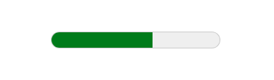
The meter element is useful for visually representing a value relative to it’s minimum, maximum, and optimum values. It has 5 relevant attributes which can affect it’s UI: min, low, max, high, optimum, value. The default appearance is a small colored bar, and the color depends on these attributes. It’s a bit unintuitive at first, if you ask me.
Because you have 4 numeric attributes, you can have 3 ranges:
mintolowlowtohighhightomax
The optimum value us a number that can sit within any of those ranges. If the value is in the same range, the meter will be green. If the value is in an adjacent range, the meter will be yellow. And if it’s farthest away (for example, optimum is between min and low, while value is between high and max) the meter will be red.
I hope that makes sense.
Let’s look at an example. We might have some school assignments with grades. Obviously the optimum value is on the higher end, so we’ll put it between high and max. Then we can have 3 meters representing a low, medium, and high grade.
<label for="grade1">
  Grade 1
  <meter id="grade1" value="60" min="0" low="70" high="85" max="100" optimum="95"></meter>
</label>

<label for="grade2">
  Grade 2
  <meter id="grade2" value="80" min="0" low="70" high="85"  max="100" optimum="95"></meter>
</label>

<label for="grade3">
  Grade 3
  <meter id="grade3" value="90" min="0" low="70" high="85"  max="100" optimum="95"></meter>
</label>
Then we could say that if you get a lower grade, you get a pale red color, if you get a medium grade, you get a boring khaki color, and if you get a high grade, you get an exciting rainbow. The styles are pretty easy, it’s just a lot of vendor specific pseudo-elements:
meter {
  width: 100%;
  height: 2rem;

  /* Firefox styles */
  border: 1px solid;
  background: none;
}

meter::-webkit-meter-bar {
  background: none;
  border-radius: 0;
}
meter::-moz-meter-bar {
  background-image: none;
}

meter::-webkit-meter-even-less-good-value {
  background: palevioletred;
}
meter:-moz-meter-sub-sub-optimum::-moz-meter-bar {
  background-color: palevioletred;
}

meter::-webkit-meter-suboptimum-value {
  background-color: khaki;
}
meter:-moz-meter-sub-optimum::-moz-meter-bar {
  background-color: khaki;
}

meter::-webkit-meter-optimum-value {
  background-image: linear-gradient( to right, red, yellow, lime, cyan, blue, rebeccapurple, magenta);
}
meter:-moz-meter-optimum::-moz-meter-bar {
  background-image: linear-gradient( to right, red, yellow, lime, cyan, blue, rebeccapurple, magenta);
}
Unfortunately, the implementation across browsers does not match, so you have to repeat the styles with the relevant vendor prefixes for Webkit and Gecko browsers. Even still, the display will look slightly different across browsers. Heights are treated differently, and what is called the “meter bar” is interpreted slightly differently, hence the different values and implementations for borders, radii, and -webkit-meter-bar vs. -moz-meter-bar.
See the Pen https://codepen.io/Stegosource/pen/QWyaPdV by Austin (@Stegosource) on CodePen.
For some more examples of styling the <meter> element, take a look at “The HTML5 meter element” by Pankaj Parashar.
Progress

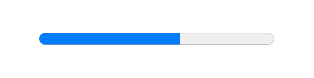
The progress element, as it’s name suggests, is used for telling users about their progress in a task. It has two states, indeterminate (default) and determinate, and it has two attributes, max and value. In fact, it’s a very straight forward element:
<label for="progress">
  Progress:
  <progress id="progress" max="100" value="60"></progress>
</label>
Styling it is also fairly straight forward, although you do have to account for some browser prefixes. For example, if you wanted your progress elements to have a grey background with a purple progress bar, it might look like this:
progress[value] {
  border: 0;
  background-color: #bbb;
  -webkit-appearance: none;
}

progress[value]::-webkit-progress-bar {
  background-color: #bbb;
}

progress[value]::-webkit-progress-value {
  background: rebeccapurple;
}
progress[value]::-moz-progress-bar {
  background: rebeccapurple;
}

progress:not([value]) {
  /* indeterminate styles */
}
Notice the use of [value] in the selectors. This is a useful differentiator between a progress element in a determinate state, and one in an indeterminate state. I’ve never had the need to style an indeterminate progress bar, but if you want to, the example is at the bottom for how you might do that.
See the Pen https://codepen.io/Stegosource/pen/abdKXPv by Austin (@Stegosource) on CodePen.
It’s important to know there are differences across browsers. Firefox has a default border while Webkit browsers do not. In this case we remove it for consistency, but you could just as well add your own. One weird quirk is if you do not set some value for either the background or the border properties, your progress element will display with the default UI even if you customize the pseudo-elements below. That is why we also set the -webkit-appearance: none;. We don’t actually need it in this example, but we would if we left the border and background as the default.
Finally, to set the progress bar’s color, we can use browser specific pseudo-elements ::-webkit-progress-value and ::-moz-progress-bar. However to fill up any of the remaining space, only Webkit provides a specific pseudo-element, ::-webkit-progress-bar. For Gecko browsers, we can put a background color on the progress element itself.
Pankaj Parashar wrote another article for CSS Tricks called “The HTML5 progress element” that’s worth checking out.
The Moderate Ones
Checkbox & Radio
I’m not sure when the first custom radio or checkbox inputs were implemented, but in today’s internet, they are quite common. You can find several articles online, and most component libraries have in some form or another.
There challenge with custom checkboxes and radio inputs is there is no way to customize the native browser UI.
This leads many developers to use something like a <div> element instead, but this is a mistake. The <input type="checkbox"> is semantically correct and has accessibility built in. It also requires that you write your HTML properly or you won’t get the right design.
Fortunately, for modern browsers there is a very simple solution: appearance: none;. This handy rule solves the problem above by visually hiding the native input UI, but unlike display: none;, it keeps the element accessible to screen readers and keyboard navigation. Sweet!
<form>
  <fieldset>
    <legend>Operating System</legend>

    <label for="windows">
      <input id="windows" name="os" type="radio" value="windows">
      Windows
    </label>

    <label id="mac">
      <input id="os" name="os" type="radio" value="mac">
      Mac
    </label>

    <label id="linux">
      <input name="os" type="radio" value="linux">
      Linux
    </label>
  </fieldset>

  <fieldset>
    <legend>Favorite JS Frameworks</legend>

    <label for="angular">
      <input id="angular" name="ck-angular" type="checkbox" value="angular">
      Angular
    </label>

    <label for="react">
      <input id="react" name="ck-react" type="checkbox" value="react">
      React
    </label>

    <label for="vue">
      <input id="vue" name="ck-vue" type="checkbox" value="vue">
      Vue
    </label>

    <label for="svelte">
      <input id="svelte" name="ck-svelte" type="checkbox" value="svelte">
      Svelte
    </label>
  </fieldset>
</form>
@supports (appearance: none) or (-moz-appearance: none) or (-webkit-appearance: none) {
input[type="checkbox"],
input[type="radio"] {
-webkit-appearance: none;
-moz-appearance: none;
appearance: none;
position: relative;
display: inline-block;
top: -0.1em;
width: 1em;
height: 1em;
border: 1px solid;
vertical-align: middle;
transition: box-shadow 0.1s ease;
}
input[type="checkbox"]:checked,
input[type="radio"]:checked {
box-shadow: inset 0 0 0 .25em rebeccapurple;
}
input[type='radio'] {
border-radius: 50%;
}
}The great thing about this code is it works with all native checkbox and radio inputs. It’s also quite open for customization. I chose to keep it relatively simple and just use an inset box-shadow to denote the “checked” state, but you have plenty of options: CSS images, background images, and even animations.
See the Pen https://codepen.io/Stegosource/pen/QWyrgPG by Austin (@Stegosource) on CodePen.
It’s also worth noting that I prefer to use em units here so that my checkbox/radio will scale up or down with my text. There are also three properties in there (position: relative; top: -0.1em; vertical-align: middle;) that are used to vertically center the input UI. You may need to fiddle with these as well, and unfortunately, it’s not a good time for display: flex.
The downside is appearance: none is not supported on Internet Explorer. That’s pretty far back at this point, so you may not need to worry about it. In case you do, we can use the @supports (appearance: none) block to progressively enhance the experience for modern browser users. You can even accomplish a similar effect with just a little more markup, but I won’t go into that.
There was a very good article on CSS Tricks called “Custom Styling Form Inputs With Modern CSS Features” by Aaron Iker that covered a lot of the same principles. It’s worth a read if you want other examples of this sort of thing.
Switch
The “switch” input is also quite common to see around the internet these days. I think it was popularized by Apple, but it’s not actually an HTML element. In most cases, because it only has two states (on or off), it’s just a fancy checkbox.
<label for="switch">
  <input id="switch" name="switch" type="checkbox" value="enabled" class="switch">
  Notifications
</label>
With the one addition of class="switch", we can actually use CSS very similar to the custom checkboxes to implement our “switch” input. Let’s assume we already have the CSS snippet above in our styles, so we only need to add the following:
@supports (appearance: none) or (-moz-appearance: none) or (-webkit-appearance: none)  {
  input[type="checkbox"].switch {
    -webkit-appearance: none;
    -moz-appearance: none;
    appearance: none;
    position: relative;
    top: -0.1em;
    display: inline-flex;
    align-items: center;
    width: 2.6em;
    border: 1px solid currentColor;
    border-radius: 1000rem;
    padding: .2em;
    margin-right: 2em;
    vertical-align: middle;
  }
  input[type="checkbox"].switch:before {
    content: '';
    width: 1em;
    height: 1em;
    border-radius: 1000rem;
    background: hotpink;
  }
  input[type="checkbox"].switch:checked:before {
    background-color: limegreen;
    transform: translateX(1em);
  }
  input[type="checkbox"].switch:after {
    content: 'Off';
    position: absolute;
    right: -2em;
  }
  input[type="checkbox"].switch:checked:after {
    content: 'On';
  }
}
If you’ve been using CSS for a while may have noticed something unusual about this code. We are styling a :before pseudo-element on the input. Most <input> elements do not have the pseudo-elements :before or :after, radio and checkbox are of the few exceptions. Combining that with appearance: none lets us hide the native UI, and apply our own.
We also add some visual text change to accompany the color change when the checkbox is checked. This is a good practice to account for color blind folks. The one caveat is that CSS does not play nicely with translation, so if you need to support multi-lingual sites, then you may need a bit more of a robust solution or stick with a regular checkbox.
See the Pen https://codepen.io/Stegosource/pen/pogKYgM by Austin (@Stegosource) on CodePen.
Once again, we are relying on support for browsers newer than Internet Explorer, but if you need to support older browsers, there are still options for that. Just ask, and I can share. And once again, you may need to play with the values to get it as you like. Take note that you may need to play around with the width, height, padding, and/or transform of the input or the :before for things to line up properly, as they do relate to one another.
Range


The range input is another one we got with the addition of HTML5. It provides a nice way for users to select a value between a min and max by dragging a little handle along a slider, which can be nicer than a plain old number input. The implementation is simple, and there are only a few attributes specific to this element.
<label for="dogs">
  How much do you like dogs?
  <input type="range" id="dogs" name="dogs" min="9" max="10" step="0.1" value="10">
</label>
Once again, the implementation is straight forward enough, but the native UI across browsers is quite different so it makes sense to add your own styles. Here’s where things get a bit more involved. It’s not difficult; just verbose.
input[type=range],
input[type=range]::-webkit-slider-thumb {
  -webkit-appearance: none;
  font-size: 1rem;
}

/* Track Styles */
input[type=range]::-webkit-slider-runnable-track {
  display: flex;
  align-items: center;
  border: 1px solid currentColor;
  border-radius: 3px;
  background-color: lavender;
}
input[type=range]::-moz-range-track {
  height: 1em;
  border: 1px solid currentColor;
  border-radius: 3px;
  background-color: lavender;
}

/* Thumb Styles */
input[type=range]::-webkit-slider-thumb {
  border: 1px solid currentColor;
  height: 1em;
  width: 1em;
  border-radius: 1000rem;
  background: #fff;
}
input[type=range]::-moz-range-thumb {
  border: 1px solid currentColor;
  border-radius: 1000rem;
  font-size: 1em;
  background: #fff;
}
Another tricky thing is that even using the pseudo-elements, there are slight variances in implementation we should be aware of. I’ll look at just Firefox and Chrome for now:
- In Chrome, to implementing custom styles for the thumb, we need to add
-webkit-appearance: none;to both the input AND the slider thumb. - In Chrome, the size of the track is based on the size of the thumb, unless you explicitly set it. In Firefox, the size of the track is defined by the native styles, unless you explicitly set it, and the size of the thumb has no impact on the size of the track.
- In Chrome, you cannot customize the thumb unless you follow the first bullet. In which case, you have to explicitly set the size. In Firefox, the size of the thumb is based on the font-size of the input, or you can set an explicit font-size or width and height.
- In Chrome, since we customized the thumb, we can set the
displayof the track toflexto make it easier to vertically center. In Firefox, the thumb and track do not have that sort of relationship, but it also is inherently centered so there isn’t the need. - In both browsers, the color of an input is not inherited unless you explicitly set
color: inherit. I like to do this on all inputs although it’s not in the snippet above.
If that sounds complicated, that’s because it is. Most of the inconsistency is around getting things to size properly. So my preferred way of setting the size across browsers is to set the track size and thumb size based on em values, then simply rely on the input’s font-size to make any adjustments as needed.
I didn’t include vendor styles for Internet Explorer, but the good news is that there is some support. To style the track, you can use input[type=range]::-ms-track, and to style the thumb, input[type=range]::-ms-thumb.
See the Pen https://codepen.io/Stegosource/pen/KKVoLaY by Austin (@Stegosource) on CodePen.
If you want to go into further details, then I would recommend the article “Styling Cross-Browser Compatible Range Inputs with CSS” by Daniel Stern.
The Difficult Ones
Fancy Checkbox & Radio
Custom checkboxes and radios is great, but sometimes they can get quite complex. Take, for example, an input where you have to choose your started Pokemon:
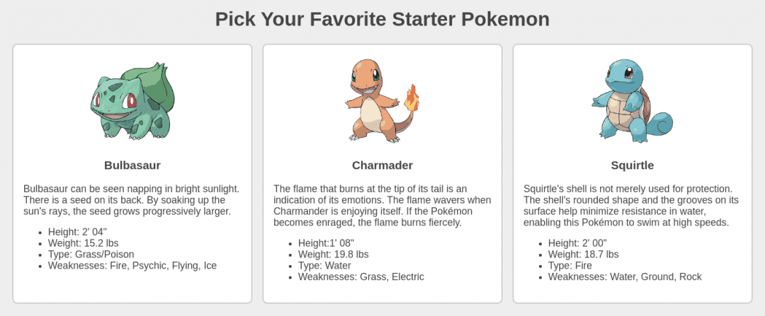
From a semantics point of view, I think this is quite straight forward. You can only select one Pokemon which means it should be a radio input. The challenging thing here is with some of the technical and accessibility considerations. Ultimately we want a user to be able to click anywhere on the card to select that Pokemon, keyboard navigation should be supported, and we should account for options being focused and/or selected.
The solution I came up with is relies on the markup for each input to look like this:
<label for="poke1">
  <input id="poke1" type="radio" name="selection" value="bulbasaur" aria-labeledby="poke1-name" aria-describedby="poke1-desc" class="visually-hidden" />
  <div class="card">
    <h3 id="poke1-name">Bulbasaur</h3>
    <div id="poke1-desc">
      <!-- description stuff here -->
    </div>
  </div>
</label>- Wrap the entire option in a
<label>. This makes the entire “card” clickable in order to select theradiooption without the need for JavaScript. - Place a “visually hidden”
radioinput right before the “card” element for styling purposes (this will be explained below). - Use an
aria-labeledbyattribute to overwrite the label of the input. This is assigned to the Pokemon title. You could instead usearia-labelif there is not an element that makes sense as a label. - Use
aria-describedbyon the Pokemon description within the<label>so that the content is still accessible.
That covers our semantics, and most of our accessibility needs, however there are two things we still need to account for. Since the input is visually hidden, we lose any sort of visual feedback for the focus and selected options. Fortunately, the solution is quite simple:
input:focus + .card {
  box-shadow: 0 0 0 .25rem mediumpurple;
}

input:checked + .card {
  color: #fff;
  background: indigo;
}
By placing the “card” element immediately after the input, we can take advantage of the Adjacent Sibling Combinator (+) again to add special styles to the “card” element any time it’s input is either focused or checked.
See the Pen https://codepen.io/Stegosource/pen/OJMEQrZ by Austin (@Stegosource) on CodePen.
A similar result can be achieved by putting the input inside the “card” and using the :focus-within pseudo-class, but :focus-within is not supported in IE and I don’t know how to style the selected element without JavaScript.
File
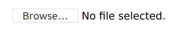
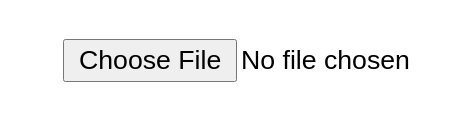
There are a few reasons that make the file input a bit more challenging to work with.
- The native UI is a combination of a button and some text.
- Across different browsers, the implementation varies.
- Customizing the text that comes in the native UI is not trivial.
These are all good reasons to want to create your own custom UI, and some folks opt to build it without using the native input at all. I don’t like to do that because I think there is a lot that is lost in terms of semantics, accessibility, and even features in that case.
The native file input supports the following features. By incorporating the native file input, we’ll get some of this for free:
- Click to open file picker UI
- Drag and drop to select a file
- Support for
multipleattribute - Tab navigation support
- Visible focus state
Similar to the fancy card radio, this custom file selector also has some stricter requirements from the markup:
<label for="file">
  <input id="file" type="file" multiple class="visually-hidden">
  <div class="dropzone">
    Select files
  </div>
</label>
We start with a native file input, and we give it the visually-hidden class. This way, visual users will not see the native input, but it will still be reachable through keyboard navigation. We then have a div with the “dropzone” class immediately after the input. It’s important that this div is a sibling of the input, and because they are both inside the label, the text will serve as the input label, so let’s be sure that it makes sense. If you want to change it to something that doesn’t make as much sense, you can always put an aria-label on the input, but keep this div as a sibling.
Next, let’s throw some more CSS in there to make the div look the part of a dropzone. Feel free to play around with the styles here as you see fit. I’ve just made something with a dashed border, a bit extra height, and with some centered text.
.dropzone {
  display: flex;
  justify-content: center;
  align-items: center;
  border: 2px dashed currentColor;
  border-radius: .25rem;
  height: 3rem;
}

.dropzone--droppable {
  background: lightblue;
}

input:focus + .dropzone {
  outline-width: 1px;
  outline-style: auto;
  outline-color: Highlight;
  outline-color: -webkit-focus-ring-color;
}
The .dropzone--droppable part will make more sense in a moment, but for the time being, take a look at the last block. Our file input is visually hidden, so there is no feedback when a keyboard user focuses on the input. To account for that, we use the CSS adjacent sibling combinator (+) to target the “dropzone” and add some focus styles to that. The rules I have here mimic the native browser focus ring, but you can use whatever outline styles you want. Just be sure to include some sort of visual cue.
Lastly, the hard part is to recreate the file drop feature. We made it this far without the need for any JavaScript, but we will reach for it here to get us over the finish line.
There are a few events we will need to attach event listeners to: dragover, dragenter, dragleave, and drop. For dragover we only need to prevent the default behavior. Otherwise, when we drop the files, the browser may navigate away. dragenter and dragleave are useful just for toggling some CSS classes so that we can provide some visual feedback. Finally, the real work of handling the file drop happens in the drop event handler.
const input = document.querySelector('input[type="file"]')
const dropzone = document.querySelector('.dropzone')

dropzone.addEventListener('dragover', (event) => {
  event.preventDefault();
});
dropzone.addEventListener('dragenter', (event) => {
  event.stopPropagation();
  event.target.classList.add('dropzone--droppable')
});
dropzone.addEventListener('dragleave', (event) => {
  event.stopPropagation();
  event.target.classList.remove('dropzone--droppable')
});

dropzone.addEventListener('drop', (event) => {
  event.preventDefault();
  event.target.classList.remove('dropzone--droppable')

  let files = event.dataTransfer.files

  if (!input.multiple && files.length > 1) {
    const dataTransfer = new DataTransfer()
    dataTransfer.items.add(files[0])
    files = dataTransfer.files
  }

  input.files = files

  input.focus()
  input.dispatchEvent(new Event('change'));
});

input.addEventListener('change', (event) => {
  const files = Array.from(event.target.files)
  console.log('Do something with files:', files)
})
Inside the drop event there are a few things going on:
- Prevent the default behavior, and also remove any styling classes we’ve added before.
- Capture the event’s files from the event’s
dataTransferproperty. - Limit the number of files based on the input’s
multipleattribute. - Attach the files to the input’s
filesproperty. - End with setting
focuson the input, and emitting achangeevent.
The cool thing about this dropzone is that by relying mostly on the input, we are providing a better experience for mouse users without compromising any of the functionality or features for keyboard users. It even works fine without JavaScript since the “dropzone” is a label.
The only thing that doesn’t work without JavaScript is the drag-and-drop. If you absolutely must allow for the file drop feature on the input, then it’s quite easy to implement JavaScript detection. You could use CSS to show the input and hide the dropzone if JavaScript is not enabled.
See the Pen https://codepen.io/Stegosource/pen/VwerogQ by Austin (@Stegosource) on CodePen.
This implementation is not quite feature complete. For that, it we would really need:
- Updates to the UI showing if and how many files are selected.
- Ability to update and/or clear the selected files.
The goal of this article, however, is not to build a fully featured file picker. It was to show how you might style one. If you want to finish up these features for practice, I would encourage you to fork the example. Most of the styles and functionality are there. Let me know what you come up with 😄.
The Rest
I’m won’t be covering the remaining elements. date inputs and color are far too complicated to add to this article. They would really require their own dedicated post to get into all the nuance around styling and accessibility. As for datalist, it’s quite straight forward to style the input, but the selectable options suffer the same issues as the <option> tag in that they cannot be styled.
Styling States
Inputs can have many states: required, disabled, focused, invalid. The good news is that if you write your code semantically, the browser can communicate these states, keeping things nice and accessible. However, the browser may or may not provide visual cues about these states, so you will want to account for them in your styles.
Required & Optional
HTML5 input validators make it easy enough for us to mark an input field as required by simply adding the required attribute:
<input name="example" required>However, for visually able users that are not relying on assistive technology, it’s helpful to include some sort of cue to denote required fields. The most common I’ve seen is a red asterisk, and you can achieve that by adding the character to your HTML, or with CSS.
If you prefer the HTML approach, you will be doing your screen reader uses a favor by wrapping it with an aria-hidden attribute so it is not read out loud.
<label for="example">
  Label text <span class="color-red" aria-hidden="true">*</span>
  <input id="example" name="example" required>
</label>
.color-red {
color: red;
}Should you prefer adding the asterisk with the CSS, I can think of two options. Either using the content property, or using a background image. I will recommend the background image because as much as I searched, I did not find a good accessible approach for using the content property. The problem being that by adding the asterisk as content it will be read to a screen reader, which is not ideal. There is a spec for alternate text for the content property, but browser support is not great.
<label for="example">
  <span class="required-label">Label text</span>
  <input id="example" name="example" required>
</label>
.required-label {
padding-right: .6em;
background-image: url('data:image/svg+xml;utf8,<svg xmlns="http://www.w3.org/2000/svg" viewBox="0 0 32 32" fill="red"><path d="M16 2 L20 12 30 12 22 19 25 30 16 23 7 30 10 19 2 12 12 12 Z" /></svg>');
background-size: 0.5em;
background-repeat: no-repeat;
background-position: top right;
}Lastly, if you only want to apply styles to the input (not elements before it), you can use the :required and/or :optional pseudo-selectors.
input {
  border-left-color: blue;
}

input:optional {
  border-left-color: yellow;
}

input:required {
  border-left-color: red;
}
Disabled
The disabled attribute tells browsers and assistive technology that an interactive element is disabled (duh). It’s pretty straight forward, and so are my preferred styles.
<input name="example" disabled>input:disabled,
select:disabled,
textarea:disabled,
button:disabled,
a:disabled {
opacity: 0.7;
cursor: not-allowed;
}Browsers provide their own styling for disabled inputs, but chances are you are not using the native browser styles. In those cases, you should make sure to account for disabled elements. I like to do this by adding opacity and a not-allowed cursor. The opacity usually gives enough visual distinction without having to rely on specific colors.
Focused
For visually-abled folks using keyboard navigation, we always want to account for the focus state. I’ve shown some ways to do that in a few of the examples, but I want to point out this snippet specifically:
input:focus + .next-sibling {
  outline-width: 1px;
  outline-style: auto;
  outline-color: Highlight;
  outline-color: -webkit-focus-ring-color;
}
It covers a few key points.
- If we ever want to target an element based on whether it has focus or not, we can use the CSS
:focuspseudo-selector. - To target sibling elements we can reach for CSS combinators, specifically
+or~. - The styles for this rule show how to imitate the browser’s native focus ring. Although you could just as well use a fully custom one if you prefer.
The golden rule to keep in mind about focus states is that you should always account for it. Never remove the default outline unless you replace it with some visual change. I like to use box-shadow because it sticks to the edge of the element and respects the border-radius, unlike outline.
Valid & Invalid
The last states to cover are for valid and invalid inputs. They can be very useful for giving a user feedback on whether they are filling out a form properly or not. Fortunately, CSS provides use with some more pseudo-classes, :valid and :invalid.
Let’s say, for example, that you wanted to add a red bottom border for any invalid inputs:
input:invalid,
select:invalid,
textarea:invalid {
  border-bottom-color: red;
}
Conversely, you may decide to only add a green bottom border for valid inputs:
input:valid,
select:valid,
textarea:valid {
  border-bottom-color: green
}
Alligator.io has a very nice article with more examples called “Styling Form Inputs in CSS With :required, :optional, :valid and invalid“. However, the biggest issue I have with this is that the feedback is immediate. I personally prefer to have a chance to fill out the input before being told whether it’s valid or not. If you wanted to do that, you would likely want to reach for JavaScript and listen for the blur event on each input, or the submit event on the form and then highlight the invalid inputs.
Readonly
There is a little-known input attribute called readonly which prevents inputs from being editable, but still showing a value. It’s a bit like disabled, but not quite the same. As it provides a different experience for users, it’s probably a good idea to visually denote that it’s slightly different than a normal input, or a disabled input. My preferred way of doing so is to use a dotted border (unless your standard inputs are dotted), and the not-allowed cursor.
input[readonly] {
  border-style: dotted;
  cursor: not-allowed;
}
The nice thing about these styles is the rest of the input styles can be adopted from default input styles, but we have some visual delineation, and if the user hovers over the input, they will get a little more feedback.
Closing Remarks
Wow! That was a lot. Hopefully you found it useful, and if you have any comments, recommendations, or corrections, please let me know.
I think the key takeaways are:
- Focus on semantics and accessibility before getting into the design.
- The
visually-hiddenclass is a useful utility in any project. - The
appearanceproperty and CSS combinators can get you very far. - Remember to test all the different inputs and all their different states.
- And always try to use what the platform provides for consistent and accessible experiences.
Thanks for stopping by my corner of the internet. Here, there are no ads, trackers, paywalls, accounts, etc. It's hard, but worth the better experience. If you'd like to keep this site up, consider hiring me, making a donation, buying something (soon), leaving a comment, or sharing. It helps more than you know. I'm glad you're :)

[…] Quelle: How to Build HTML Forms Right: Styling […]